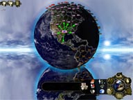
As already hinted at in the last post I decided to change the visual style of PjW towards a different look, which gives the player the feeling of actually having the earth between his fingers, rather than just feeling like floating around it in space. So the last days I spent on changing the visuals of the main 3D view (where you’ll spent most of your time) like I did with the nation selection screen.
If you take a look at the screenshot on the left you’ll quickly notice that it has changed drastically from the earlier versions and I myself feel this looks and feels much better than the old version. First there is the sky background, which is different depending on the nation you choose (that’s one part of the uniqueness of the different nations, the player should always directly see what nation he choosed, so besides the different backgrounds I’ll als add minor differences to the UI depending on the selected nation). Second is the rippling (and moving) reflection on the ground which adds some dynamics to the scene itself. And lastly the earth is now using an advanced shader for rendering it’s surface. The shader itself was done by 3DLabs for one of the Workspaces in Rendermonkey (but can be freely used as long as it’s mentioned) and uses a base-texture, a night-light map and a cloud cover. It’s got a moving night-day border, so while playing you’ll see the how that border slowly moves across the globe (another one for making the scene look less static). In addition to that I also added glowing region borders to the shader.
So much for now. I really like the new style much more than the old one. It’s dynamic (and therefore not that boring as the old one) and makes the earth look more plastic, therefore giving you more of a “it’s mine!"-feeling than the old view.
