After putting a many hours into the latest Guild Wars Chapter (and still enjoying it) I returned to work on PjW again.
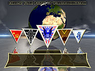
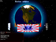
One of the parts back from the old version still in the current build was the nation selection screen, and I really disliked this one. So after having the initial idea on how the new one had to look, I did a quick drawing of my new ideas and spent the last few hours on creating a new one. This one looks much more polished and clean and I really prefer it over the old one.
You can see both versions of the nation selection screen below (click on it for a bigger picture), with the new one being the one on the left :
Looks a lot better, doesn’t it? What you can’t see in the static screenshot are the dynamic water reflections which are realised using noise and a GLSL-shader. As you can also see it’s still not totally finished, but adding descriptions and the few other missing minor things should be done quick.
So stay tuned for more news to come…

