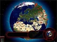
Did some more work on the GUI and I guess what I’ve got now is going to make it into the final game (the screenshot already comes from within the game). It has the control center with all important buttons (still not named on the screenshot) and also plenty of space for the information the player needs to know about.
And, most important, it (at least in my opionion) perfectly fits the theme of the game. It’s the red color and glow that always tells the player that he should be in a state of alert, as all possible things can happen. Now the next step is to label the buttons and also add some nice background graphics to them. I don’t want to do plain labels, as that would kind of destroy the “flow” of that UI part, so I’ll try some graphics with overlayed captions that don’t stick out to much. Second next thing then is the distribution and positioning of the information on the yet empty parts of the UI, but I already have some ideas about what to put on it and where to put it.
