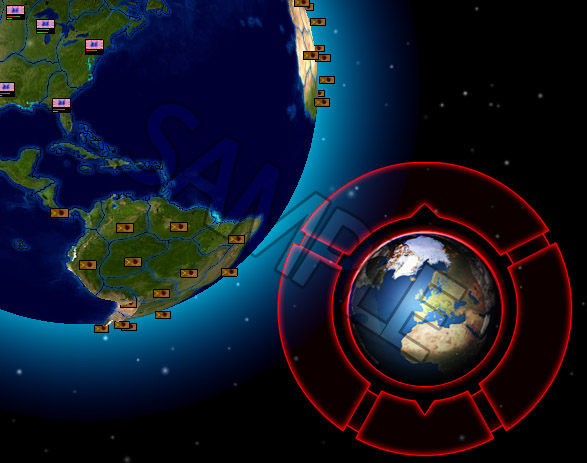
I spent some hours doing the basic layout for the control center of the game I already posted about. After doing some drawings (by hand) to get a hang on how it should look, I fired up photoshop and after several hours (and several designs) I came up with the skeleton you can see in the screenshot (click for bigger view) on the left. Right now it misses captions and symbols, so you can’t see what the buttons (the globe in the middle is, maybe as you already guessed, for ending the current round) are done, but that’ll be added. This also shall be the main-part of the UI in the final game which is used to access the most important “parts” of the game, and my idea behind it was to give the player an easy way of accessing the most important things with a single click, and nothing should be burried deeper than two clicks. Cause especially in complexer games you often have even important functions buired under buttons which are only accessible after several click-throughs, and that is something I really dislike so I try not to drift into that direction with this project. So besides the 3D-globe and this control center, there won’t be much more on the screen (by default, which means unless you open some windows of course) except an addtional information bar in the top of the screen which I yet have to design. This bar will contain all (yes all, I want to have the player to be easily able to see all important informations without having to open different windows or so) important information, though there will also be statistics and stuff you can access via an extra window. And to make the style fluent, that bar will look a lot like that control center in the shot above : simple but with style.
So much for now, stay tuned for the next update ;)